NerdUp by NerdWallet
Why would NerdWallet make a credit card?
In 2023, NerdWallet expanded its offerings, moving from a company that offered digital-only content and products, to a business that could "put its money where its mouth is" by offering more tangible products like credit cards and financial coaching.
The idea behind NerdUp by Nerdwallet was to create a credit card for underserved audiences with low or no credit. This card offered a way for people to build their credit the smart way with no interest, annual fees, or fine print. I worked closely with content strategists and NerdWallet's design director to build out the name, brand, and look for this product.
Just a few of the initial explores for the card design
The shortlist after the team came up with 100+ names
Initial explorations
Although the process of creating a credit card product took NerdWallet quite some time, the brand team had a relatively small window to turn around a name and "brand" for the product.
To find the right name, the entire brand team brainstormed over a couple of days, coming up with a ton of options that ranged from evocative, to functional, to experiential. During that time, I explored a range of visual directions for the card — incorporating new and existing visual language from our brand including illustration, typography, collage, and our logomark.
Final logo
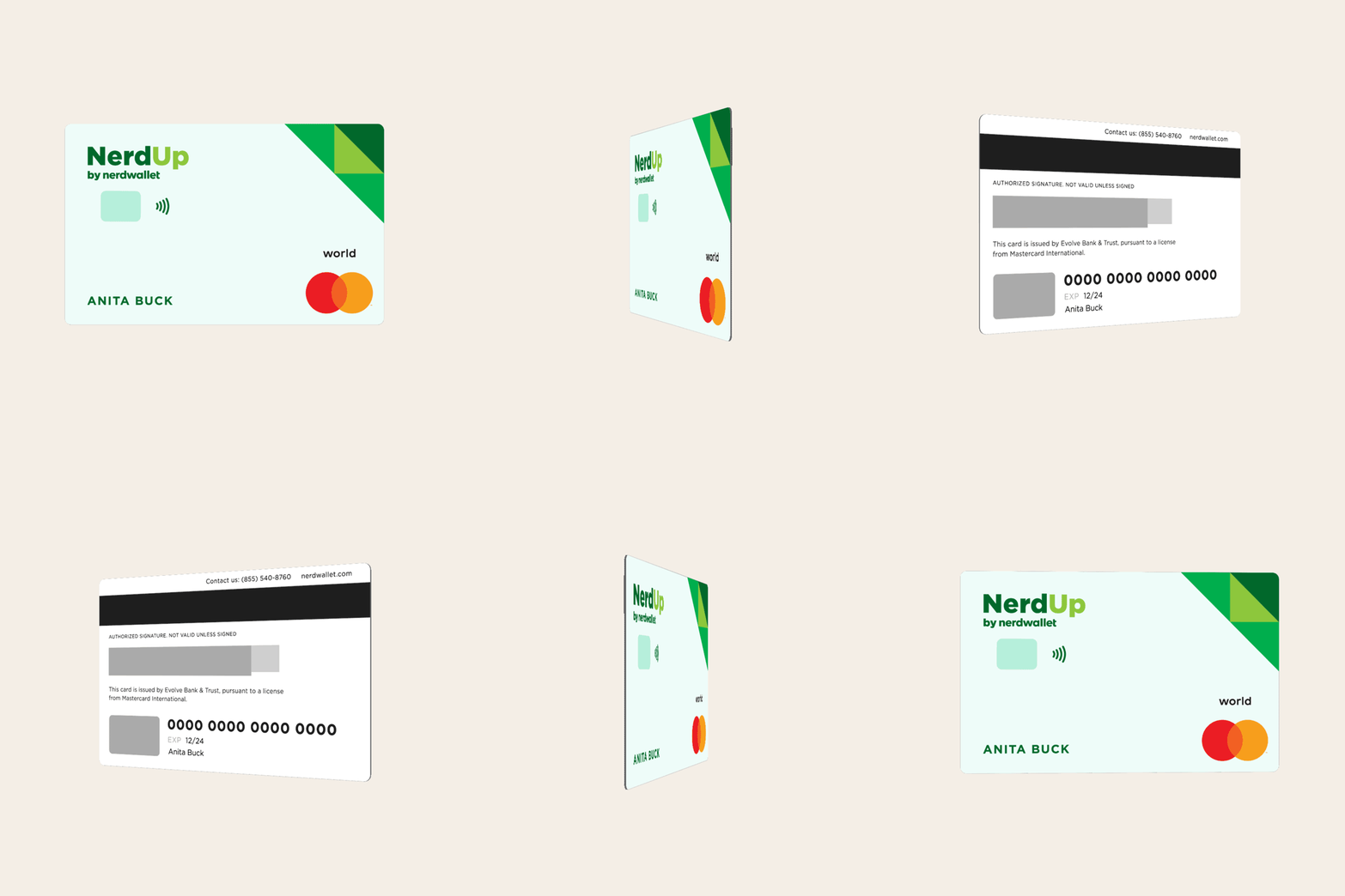
Physical card
Where we landed
Given the goals of the project, we moved forward with NerdUp by NerdWallet. The name felt inherently optimistic and implies progression, so it was a good fit for users who would be signing up for the card to grow their credit in a safe, reliable way.
As for the card design, we decided to incorporate our logo's facet elements on a light green card. These elements are used across lots of NerdWallet surfaces including our branded campaigns, our website, and print and digital channels. This helped reinforce the NerdUp card as something endorsed by our Nerdy experts.
I also learned that when making a credit card, you need to create a physical card, virtual card, and digital-tokenized card (for things like Apple Wallet), who knew?
Physical, virtual, and tokenized card, respectively
Toolkit & landing page
In addition to the card, I built a design toolkit for NerdUp. This toolkit breaks down the NerdUp brand and its DNA: typography, color palette, and visual treatments. The toolkit exists so other designers can quickly understand the NerdUp brand, and create new assets as the program grows.
Additionally, I designed a landing page to explain the card and drive users to sign up for the product. In the video below you'll see how the toolkit comes to life on that page.
Typography
Mesh gradient examples for NerdUp assets to live on
Color palette


